
Today, more than half of searches take place on mobile devices rather than a desktop computer.
With this shift, it’s more important than ever for SEOs to adopt a mobile-first approach to their strategy in order to provide the best possible user experience.
In this post, I'll dive into the key SEO factors you need to focus on to boost your mobile search visibility and stay ahead of the competition.
Let's get started!
- What is Mobile SEO?
- Why is Mobile SEO Important?
- What Is Google's Mobile-First Index & Why Does It Matter for SEO?
- How to Configure a Website for Mobile SEO (3 Ways)
- 6 Best Practices For Mobile SEO
- How to Report on Mobile SEO
What is Mobile SEO?
Mobile SEO, or mobile search engine optimization, is the process of optimizing your website to ensure it performs well on mobile devices.
It's all about creating a smooth, efficient, and enjoyable experience for mobile users while also meeting the technical requirements set by search engines to improve your site's visibility and performance.
This involves various strategies and practices aimed at improving the user experience, search visibility, and functionality of your site when accessed from smartphones and tablets.
Mobile SEO vs. Desktop SEO: What's the Difference?
The main difference between mobile and desktop SEO comes down to user experience. Mobile devices have smaller screens and rely on touch navigation, so things like text links and buttons need to be bigger and spaced out to avoid frustration. If users can’t easily navigate your site, they might leave—and that’s a bad look for Google rankings.
Mobile search also handles title tags differently. Titles can get cut off, even if they’re fine on desktop, which can hurt click-through rates.

(Comparing mobile and desktop search results for the same query.)
On top of that, mobile users don’t just type keywords—they use voice search (like Siri or Google Voice) and image search, so your SEO strategy needs to cover those bases too.

Why Mobile SEO is Important
Mobile SEO is crucial for several reasons:
- Mobile Traffic Dominates the Web: As previously stated, more than half of all searches now happen on mobile devices. This means optimizing for mobile is essential to reach and engage your audience where they are most active.
-
Improved User Experience: Mobile-friendly sites load faster, offer easy navigation, and adapt to different screen sizes. A poor mobile experience leads to higher bounce rates and lost opportunities.
- Local Search is Mobile-Driven: 76% of local searches on smartphones result in a visit to a business within a day. A mobile-optimized site improves visibility for high-intent users.
- Core Web Vitals and Page Experience: Google emphasizes Core Web Vitals metrics like loading speed, interactivity, and visual stability. Fast, mobile-friendly sites perform better in search rankings.
-
E-commerce and Conversions: Mobile shoppers demand seamless browsing and checkout experiences. Slow or unresponsive mobile sites result in abandoned carts and lost revenue.
Plus Google's move to Mobile-First Indexing makes optimizing for mobile more important than ever...
What Is Google's Mobile-First Index & Why Does It Matter for SEO?
Google has switched to Mobile-First Indexing which means that it primarily uses the mobile version of content for indexing and ranking. Since the majority of web traffic now comes from mobile devices, this shift ensures search results better reflect the experience of mobile users.
It matters for SEO because if your site isn’t mobile-friendly, it may rank lower in search results, even for desktop users. To stay competitive, your site must offer a fast, responsive, and user-friendly experience on mobile devices, ensuring all content and functionality are fully accessible across different screen sizes.
How to Configure a Website for Mobile SEO (3 Ways)
When it comes to optimizing a site for mobile, you have three different options:
- Create a separate, mobile version of your site
- Dynamic serving
- Responsive design (recommended by Google)
To help you decide which option to choose, let's go over each one in more detail.
1. Create a separate, mobile version of your site
The main benefit of building a mobile website is that you can tailor it specifically for smartphones, ensuring a native and optimized experience. However, the downside is the need to manage two versions of your website independently. Additionally, sites with separate URLS for mobile and desktop can take longer to move to the mobile-first index.
If you decide to create a mobile version of your website, here's how to get started:
- Set Up a Mobile Subdomain (e.g., m.example.com): Create a mobile-specific subdomain (e.g.,
m.example.com) to host your mobile site. Use a Content Management System (CMS) or a framework that supports mobile-specific templates. - Implement Device Detection: Use server-side scripts to detect the user’s device (e.g., via User-Agent strings). Set up rules to serve the desktop version to non-mobile devices and redirect mobile users to the appropriate mobile URL.
- Redirect Users Correctly: Configure an HTTP 301 redirect from the desktop page to its mobile equivalent. Add the Vary HTTP header to inform search engines that content varies based on the user’s device.
2. Dynamic serving
The second option is dynamic serving that uses the same URL but triggers either mobile or desktop HTML pages depending on the device a person uses to access it.
Again, the benefit is the ability to optimize the code for mobile devices well. The downside is having to manage and maintain two different codes.
If you decide to go with this route, here's how to set up dynamic serving:
- Set Up Device Detection: Use server-side detection methods (e.g., User-Agent strings) to identify the type of device accessing your site. Implement a detection library or write custom logic to classify devices as mobile, tablet, or desktop.
- Serve Device-Specific Content: Configure your server to respond with device-specific HTML and CSS:
- Desktop users receive the full desktop version of the page.
- Mobile users receive a lighter, mobile-optimized version with simplified layout, smaller images, and touch-friendly elements.
- Use the Vary HTTP Header: Add the Vary: User-Agent HTTP header to your server configuration. This informs search engines that the content varies based on the device, helping them understand and index your pages correctly.
3. Responsive design
The third option, and the one recommended by both Google and us, is responsive design.
Why is responsive design so highly recommended? Because it serves the same HTML code on the same URL, regardless of the user's device. This means you only need to manage a single website.
With responsive design, the layout automatically adjusts to fit the screen size of the user’s device, providing an optimized experience whether they are on a desktop, tablet, or smartphone.
Here's how to get started setting up responsive design:
- Choose a Responsive Framework: Select a framework like Bootstrap or Foundation to simplify building a responsive site. These frameworks come with pre-built CSS and JavaScript components that adapt to different screen sizes, saving you time and effort.
- Use a Flexible Grid System: Design your layout with a grid system that uses relative units like percentages instead of fixed pixel dimensions. This ensures your layout resizes fluidly to fit any screen size, from large desktop monitors to small mobile screens.
- Implement Media Queries: Add CSS media queries to adjust the styling based on the device’s screen size. For example, you can change font sizes, margins, and image layouts for different breakpoints, such as screens wider than 768px (tablets) or smaller than 480px (smartphones).
6 Best Practices For Mobile SEO
Most searchers have the same intent behind their query on a mobile device as they would on a desktop. Certain factors, however, can and will affect the mobile user experience, rankings, and search visibility.
Here are the most critical best practices for mobile SEO.
#1. Enhance Content Readability
If users have to squint or pinch the screen to read your content, they won’t stick around for long.
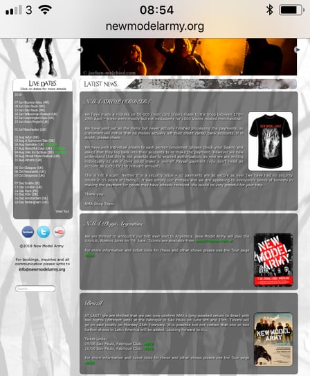
Take this example: I took a screenshot with my iPhone, and I couldn't read any of the content without zooming in. I couldn't access the navigation either. Needless to say, I didn't stay on the page for long.
Your mobile pages should display well and allow users to consume the content easily.
To achieve this, we suggest:
- Using a font size large enough for readability—many experts recommend a 14-point font. However, it’s best to test your pages on a smartphone to ensure the text is clear and accessible. This issue often appears in Google Search Console reports and the Google Mobile-Friendly Tester.
- Write content in short paragraphs (ideally no more than two or three lines) to ensure it's less intimidating and easier to skim, a common behavior among mobile users.
- Use strong contrast between the text and the background. Many people use their smartphones outside, and low contrast can make your pages harder to read in bright daylight.
#2. Optimize Page Speed
Improving page speed for mobile pages has long been a priority for SEOs for good reason.
Google uses page speed as a ranking factor and has emphasized its importance in the mobile-first index, potentially demoting slow-loading mobile pages. Plus, as Google reports, a single-second delay in mobile load time can reduce conversions by up to 20%!
To check the speed of your mobile pages, Google offers a free PageSpeed Insights tool.
However, delays for desktop users will most likely affect your visibility too. And so, when inspecting the page speed, it’s a good idea to get the full picture of your site’s performance.
seoClarity offers the insight into both page speeds and reports on where any issues occur specifically. With it, you can eliminate issues that can hinder usability for both desktop and mobile users, improving search visibility overall.
#3. Facilitate Access to all CSS or JavaScript
Many SEOs used to block Googlebots from accessing certain files, thinking it would help Google index pages more efficiently. However, this practice can be detrimental, especially for mobile crawlers. Blocking access to CSS or JavaScript can prevent Google from fully rendering a page, making it difficult to determine if it is mobile-friendly.
To ensure Google can fully render your page, use the Fetch and Render tools in Google Search Console with the user agent set to smartphone. This will help you identify if Google can access and render the page properly, confirming its mobile-friendliness.
seoClarity crawls can be ran to execute JavaScript and fetch files as a mobile device would. Conducting a separate "mobile" crawl of your site can help ensure that mobile crawlers can access all pages correctly. Our site audit technology allows you to update the user agent to Google's Smartphone user agent for this purpose.
The following settings will mimic a smartphone as opposed to the desktop: (Mozilla/5.0 (iPhone; CPU iPhone OS 8_3 like Mac OS X) AppleWebKit/600.1.4 (KHTML, like Gecko) Version/8.0 Mobile/12F70 Safari/600.1.4 (compatible; Googlebot/2.1; +http://www.google.com/bot.html).
#4. Re-Design Content for the Mobile Experience
Traditionally, mobile sites feature less content and fewer features than their desktop counterparts.
Since companies want to provide the fastest and most streamlined UX on a mobile website, it made sense to remove anything beyond the most necessary information.
Webmasters took various approaches to this. Some cut the mobile content while others hide it behind JavaScript, requiring a user to take action to see it.
While there has been a lot of discussion on the approach to mobile content, Google itself has suggested that it's okay to hide content using a Read More button. This strategy supports the user experience and is not recommended for desktop since expandable content makes the most sense on a smaller mobile device.
It's important, however, that you maintain your mobile page to contain all the content you want to use to convince Google of its authority. Re-design the content for the mobile experience so that a mobile user can learn the same information as if they were using a desktop.
This may involve re-ordering the information, but try not and simply cut out sections that bear importance.
#5. Consider Differences in Search Behavior on Desktop vs. Mobile
In the age of mobile-first, it's important to consider the differences in search behavior between desktop and mobile. This is because Google interprets each user's likely intent through micro-moments that impact how the SERP is constructed and the types of content that will appear.
If the search engine believes the user wants to find a restaurant, the local 3-pack will appear. If the user expresses an I-want-to-know micro-moment, then a Google Quick answer will appear.
Google also varies the number and placement of videos and images on the SERP depending on the likely intent.
In a search for "how to contact Actonia" on mobile and desktop, the desktop result has a "Contact Us" page as the first result while on mobile, the third result is a "Click to Call" action button.

(Desktop search results)

(Mobile search results)
Google also uses different lengths for mobile and desktop meta descriptions to best fit the device type. The meta description length is shorter on mobile displays — you can use up to 120 characters when optimizing your listing for mobile search.
After the most recent updates, however, your desktop description could be up to around 158 characters. As it turns out, your meta description must work in two different lengths.
Luckily, we know some ways to work that into your strategy.
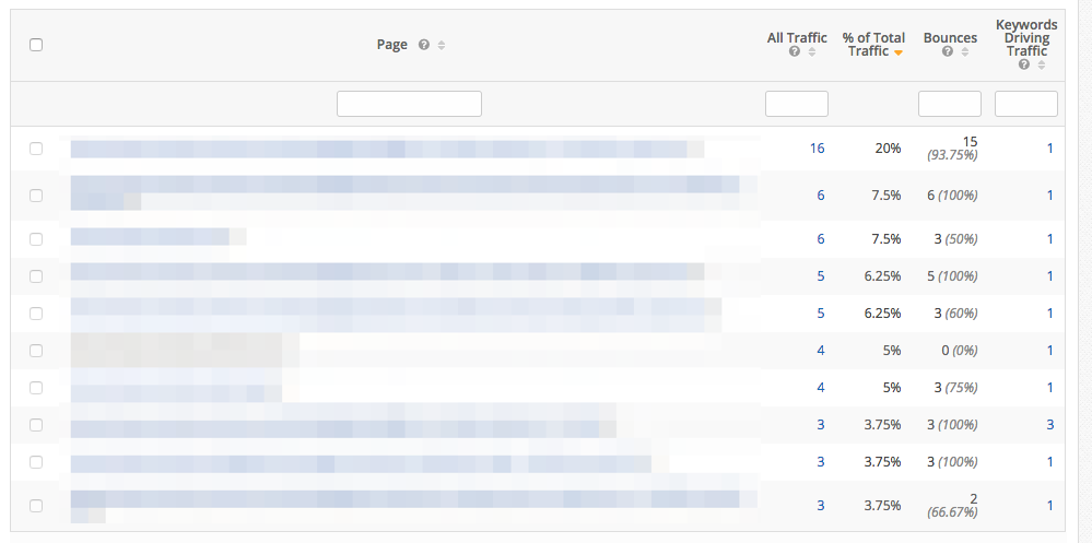
First, in seoClarity, use the Analytics report to establish how much of your traffic comes from smartphones.

Then, filter that traffic by the most visited pages. Look for assets that attract the majority of their traffic from smartphones. You can see that in the “% of total traffic” column.
Finally, use Content Fusion, our AI-powered content editor to write new, mobile-optimized descriptions for those pages and compare them with top 5 pages ranking for your main keyword.
When writing your descriptions, remember to put the most interesting information at the start. This way, even if Google cuts out some of the copy in mobile SERPs, a user will still discover the key benefits of clicking on your listing.
seoClarity users can also leverage a mobile SERP Snippet report that will reveal the title tags and description tags as found on a Google mobile results page, a direct reflection of how Google users on mobile devices are seeing your listing on Google after re-writes and shortening updates.
Remember to revisit your content strategy to ensure that you are factoring in both mobile and desktop optimized content for both types of user.
#6. Include Relevant Local Information
Finally, if your business targets customers in your specific location, then you should include relevant information on your pages and the metadata.
In particular, make sure that your mobile pages feature:
- Your standardized name
- Correct business address
- A working phone number
Be sure to add the proper HTML tags to allow a mobile user to call or get directions to your business. The absence of the click-to-call function here is the ultimate mobile-first miss!
After all, with the rise of local-intent, “near me” mobile searches, ensuring a proper local optimization has never been greater.

How to Report on Mobile Performance
We’ve covered the basics of mobile SEO. However, one of its aspects gets little attention - how to report on mobile optimization to key stakeholders. You have two options here:
1. Report on technical optimizations
In particular, use this opportunity to showcase the progress with ensuring compliance with mobile ranking factors.
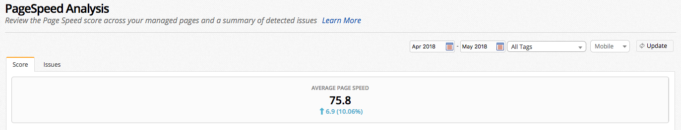
Review the page speed of the mobile site.
(Page speed report in seoClarity)
Aside from reporting on overall mobile page speed, seoClarity also provides detailed recommendations for improvements.
Clicking on the number of pages to the right reveals which content has been affected by the issue and what you should correct there.
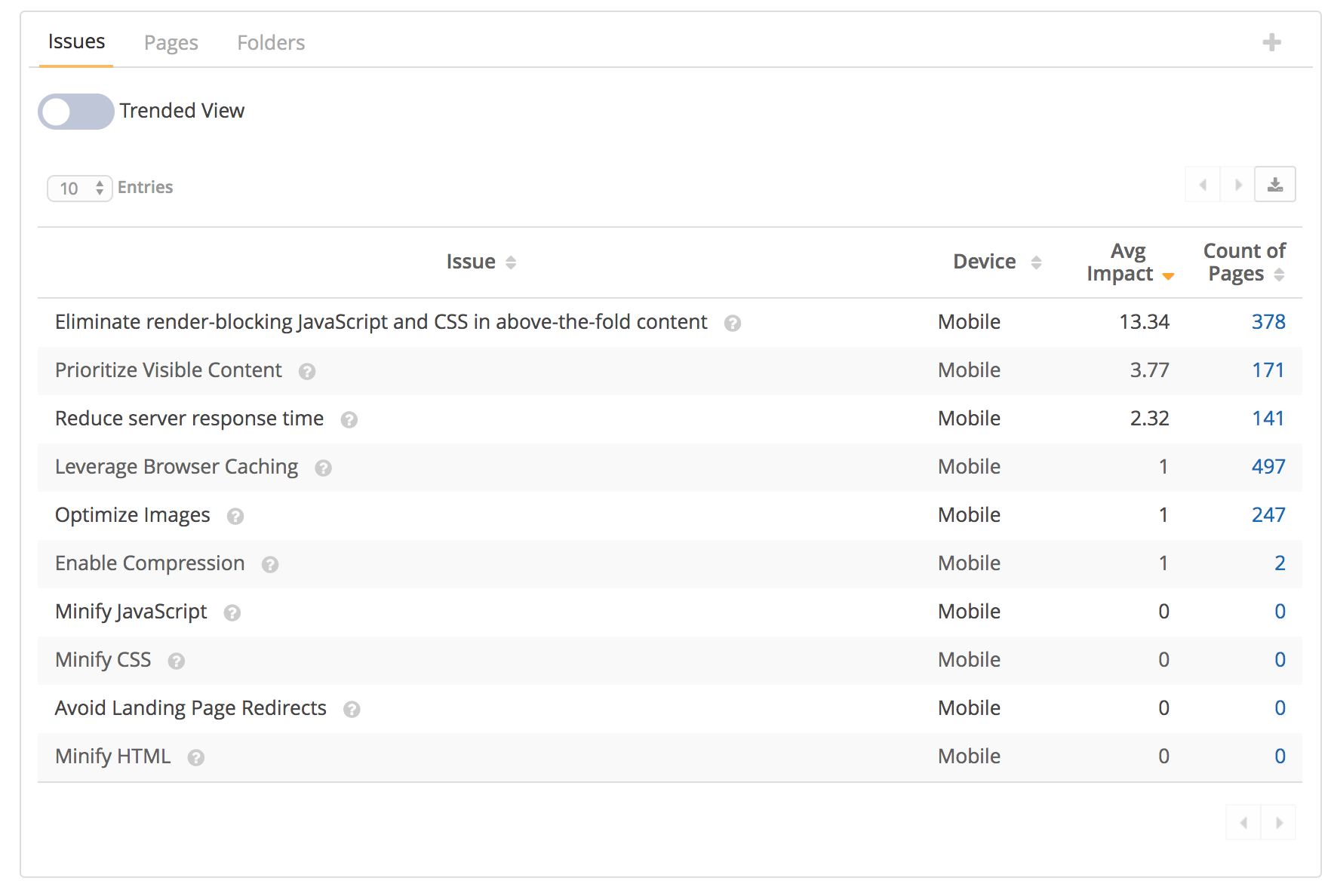 (Mobile page speed recommendations in seoClarity)
Finally, when setting up the site audit, you can select Googlebot (Smartphone) as the user agent to conduct a mobile site crawl only.
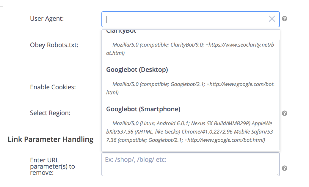 (Site Crawl settings in seoClarity)
2. Report on Performance in the Mobile Search
With 64% of Google traffic coming from mobile devices, it’s imperative to show how your website performs for mobile searchers.
seoClarity offers a number of ways to do so.
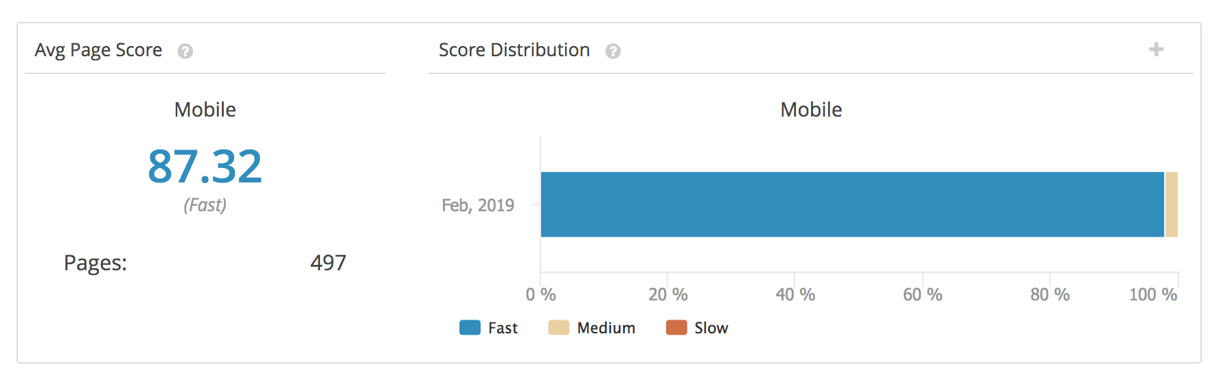
First, you can review mobile traffic in Search Analytics. The report below shows ranking changes for mobile and tablet devices. With Rank Intelligence, you can review changes in Google Mobile rankings for the time frame you’ve specified.
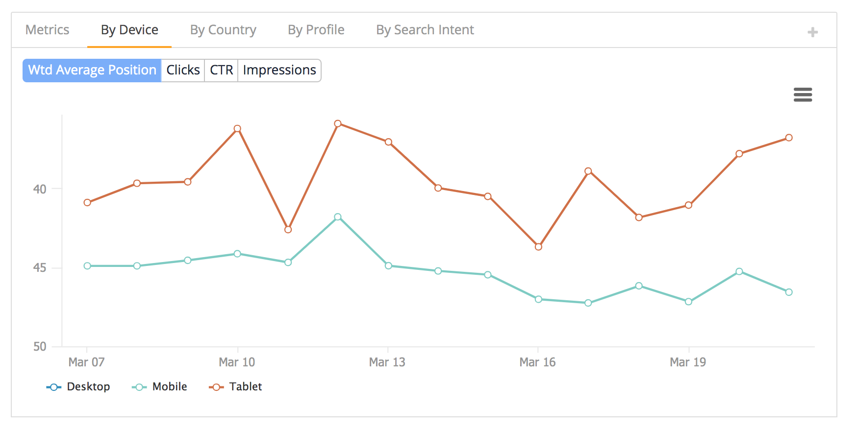 (Search Analytics data in seoClarity)
You can also review both desktop and mobile rankings side by side. Often, desktop and mobile rankings differ for the same keyword and it’s critical to monitor them to gain the true understanding of your visibility.
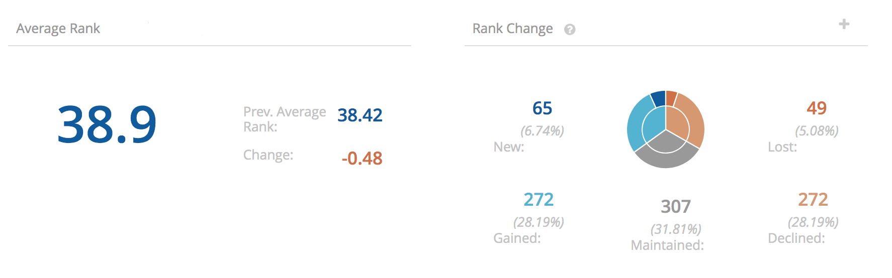 (Mobile and desktop rankings overview in seoClarity)
Conclusion
More and more people today search on mobile when looking for or evaluating new products or services.
As a result, improving search visibility has more to do with mobile SERPs than just responsive design and desktop version of your site. The 6 critical SEO factors above can impact your success in mobile search.
Editor's Note: This post was originally published in June 2018 and has been updated for accuracy and comprehensiveness.


Comments
Currently, there are no comments. Be the first to post one!