
Google recently recommended that companies with websites that do not currently have a mobile responsive designed site move to as it's the most efficient way to prepare for the mobile-first index.
But what if you already have a separate mobile site, and want to continue with that approach to deliver a mobile-optimized experience? Or simply don’t have the resources to transition to a responsive layout?
Can you ensure that you’ll retain your search visibility once the mobile-first index goes live?
Yes, you can.
And in this post, I’ll show you 5 steps you could take to prepare your m. site for the mobile-first search index. But first...
Why Prepare for the Mobile Index At All
If you’ve already been running desktop and mobile versions of the site, then taking any additional steps to prepare for the mobile index might seem quite pointless, right? Unfortunately, no.
You see, Google uses only desktop index at the moment. This means that it doesn’t actually index mobile sites. Therefore, once the mobile-first index rolls out, it will index your mobile content before ranking it. But I admit, it may be hard to imagine the real impact of re-indexing your site on the rankings. Here is a quick test to determine that impact.
Open your rank tracking tool, and filter the results to display your mobile site’s top rankings.
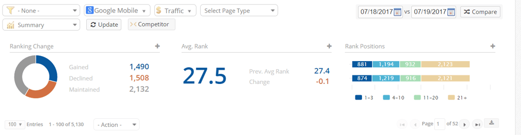
Now, decline those rankings by 2 positions, and calculate the impact of that drop.
(Note: You can do that by using Google Search Console data to replace the average CTR of keywords in those positions with click-through rate for the lower position.)
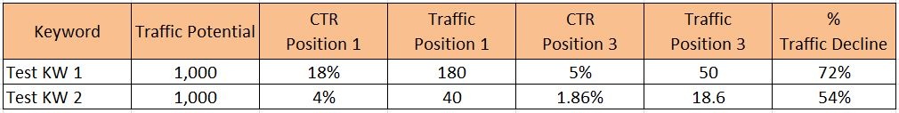
See what I mean? A two position drop could have significant implications for your business. In this example, we used a range for the CTR (4% - 18%) to demonstrate the traffic loss potential. Regardless of specific keyword CTR, the traffic decline is great, ranging from 54% - 72%.
So how do you ensure that your mobile site is ready for the mobile-first index?
Checklist to Prepare Your Site for the Mobile-First Index
To ensure your site is ready for this shift, it's important to implement a strong mobile SEO strategy. Here's how to get started:
#1. Verify that Googlebot can access your mobile site
Firstly, determine whether Googlebot (not just the Googlebot-mobile) can actually access your mobile site and all its content.
As Jun Mukai, a software engineer from the Mobile Search Team at Google pointed (cited via SEL):
“Googlebot, our crawler, must crawl your site before it can be included in our search index.”
To do this, add the robots.txt file to the mobile site and test it in the Search Console.
However, if you want to be absolutely sure that nothing might prevent Googlebot from indexing your content, then consider scanning it with a web crawler. Our own site audit tool, Clarity Audits, for example, allows you to imitate the search bot scanning your site, and establishes any potential roadblocks it might encounter.
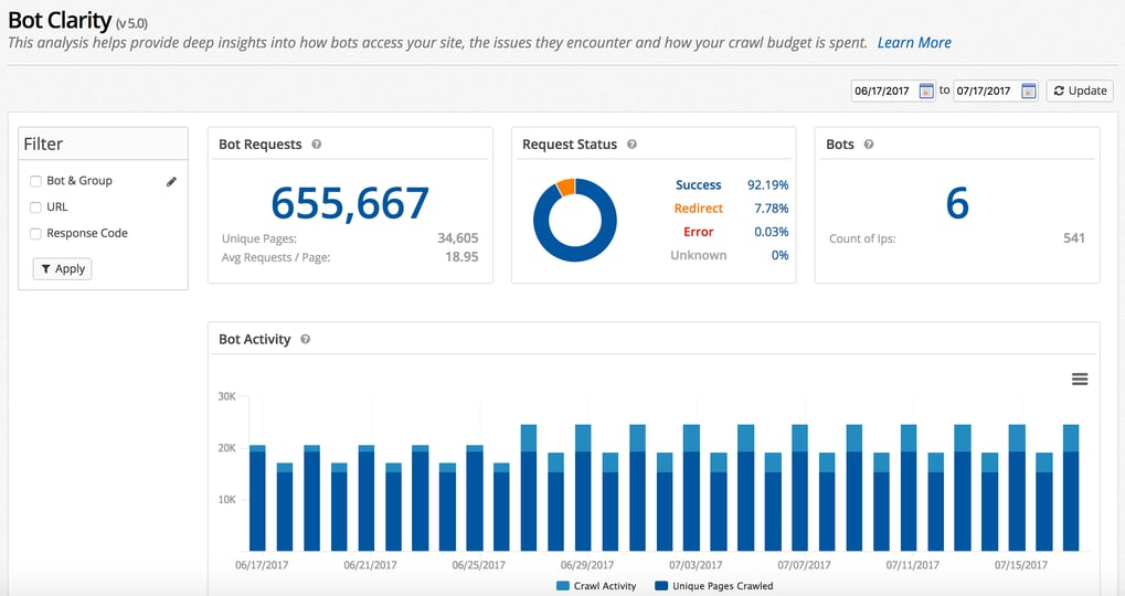
Alternatively, Bot Clarity, our server log-file analyzer, tracks activity from search engine bots, and reports on what pages have been crawled, and issues bots have encountered while indexing your content. Here's a
#2. Match structured markup for both the desktop and mobile version
As I explained already, to evaluate a page’s content, Google currently looks at the desktop version. But once the mobile-first index rolls out, it will start analyzing the m. version first, if available.
As Google explained themselves:
“To make our results more useful, we’ve begun experiments to make our index mobile-first. Although our search index will continue to be a single index of websites and apps, our algorithms will eventually primarily use the mobile version of a site’s content to rank pages from that site, to understand structured data, and to show snippets from those pages in our results. Of course, while our index will be built from mobile documents, we’re going to continue to build a great search experience for all users, whether they come from mobile or desktop devices.”
To prepare your m. site for this change, ensure that the structured data you use on the mobile site matches its desktop counterpart.
Also, just like your desktop site is verified in Search Console, make sure you add and verify your mobile version is Search Console if you haven't already.
#3. Add more content to the mobile site
Fact: The biggest change with the mobile-first index is how it would evaluate a page’s rankings. Instead of looking at your desktop pages, it will take the m. content into consideration first. This is potentially where your biggest challenge with preparing for the mobile-first index might be.
Let me explain:
With desktop sites, Google said that content hidden in tabs, accordions, and expandable boxes and other methods would not be weighted as high. But when it comes to mobile, Google's Gary Illyes said that content like that will be given full weight if implemented to enhance the user experience. The idea is that expandable content makes sense on mobile and not so much on desktop.
And Google’s own words I quoted above explain that quite well. They say:
“Although our search index will continue to be a single index of websites and apps, our algorithms will eventually primarily use the mobile version of a site’s content to rank pages from that site…”
Currently, Google uses your desktop content to evaluate rankings. But once the new index rolls out, its attention will point towards the mobile site. And in that case, if your m. pages feature shortened versions of the desktop content; then that might affect your rankings. To avoid this, you need to ensure that your mobile and desktop content match. Or even better, update m. pages with even more content to help boost rankings.
As Barry Schwartz put it on SEL:
“If [mobile site] has less content on page A than the desktop version of page A, then Google will probably just see the mobile version with less content.”
#4. Improve mobile content formatting
The same principle goes for the mobile content formatting, the inclusion of subheading tags (i.e. h1, h2..), meta tags, and other on-page optimization elements. Since Google will look at your m. site first, you need to make sure that mobile site pages include all on-page elements that typically help search engines establish how to rank content.
#5. Don’t change the canonical tag
I’m sure that right now, your m. site’s canonical tag points to the desktop URL, to ensure that this gets indexed. And after hearing so much about the need for optimizing the mobile site for indexing, you might be tempted to change the canonical tag to mobile.
Don’t. Your canonical tag should still point to the desktop site, as you have it right now.
The Best Long Term Solution - Move to a Responsive Layout
Before we go any further, let me be clear on something:
There is absolutely nothing wrong with having a mobile version of the site.
But as I’m sure you’re aware already, using the m. site carries some challenges with the mobile-first index. For example:
- You need to maintain two versions of the site. But only one of them actually contributes to how your domain ranks.
- You manage two versions of the content too, leaving a lot of room for error.
That’s why Google recommends moving to using a responsive design. And there are some good reasons why it’s the best investment you can make for your site:
- Sites using responsive layout don’t have to change anything as they are optimized from the start for display on various devices.
- A responsive site is the same as your desktop site, meaning that you need to manage only one web entity. This might come particularly useful in the future, when Google releases more changes to how it ranks mobile sites.
- Separate mobile and desktop sites make the attribution of link equity to the mobile version harder to determine for search engines.
Closing Thoughts
Moving to a responsible layout might be the easiest way to prepare for the mobile-first index. But if your organization already has a separate mobile site, and is intended on keeping it, then from this post you should know what to do to ensure your rankings won’t be affected once Google switches to a new index.


Comments
Currently, there are no comments. Be the first to post one!