
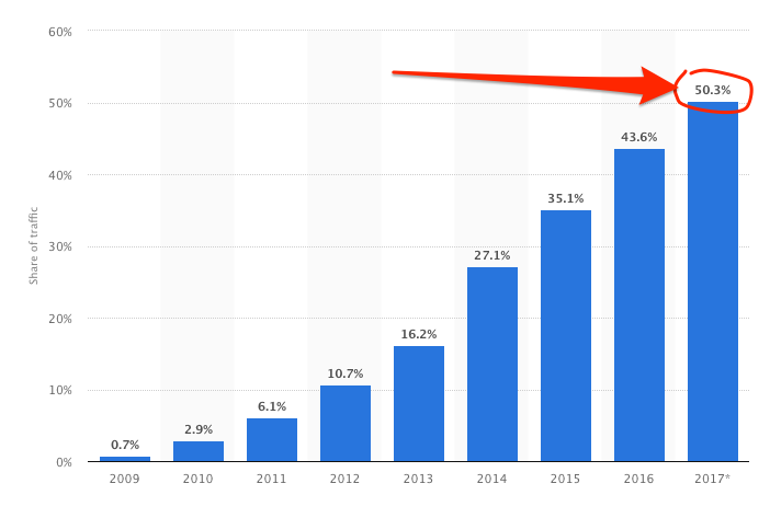
There is no doubting the shift to mobile from an SEO focus. The best teams are truly approaching their work "mobile-first." After all, for most websites now, according to data from Statista, mobile traffic has already surpassed desktop.
Users also tend to spend more and more time on mobile devices.
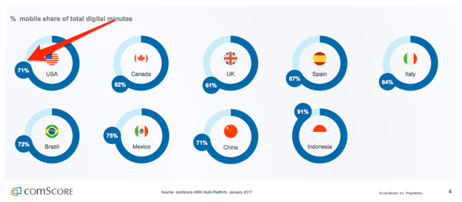
According to comScore, for example, in the US, 71% of total online minutes are spent on mobile devices. In Indonesia, that number has already surpassed 90%.
And then there’s the upcoming Google’s mobile-first index that will put mobile pages ahead of their desktop counterparts.
All this, and more makes it crucial for brands to build a mobile presence, ideally by using a responsive design.
This post will focus on the benefits of using responsive layouts to mobile sites. And then, guide you through steps of optimizing and launching a responsive design for your organization.
How Is Responsive Design Different from Having a Mobile Site?
If your organization already has a mobile site, then you might be wondering:
Why should I move to using responsive design then?
After all, the mobile site already helps you provide a strong mobile experience to your users.
Unfortunately, there is a catch. Actually, more than one.
#1 - Maintenance of Two Separate Versions
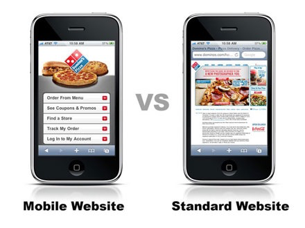
To start, mobile site forces you to maintain two separate versions of the content and your overall site. Mobile and desktop sites are separate entities, and often present different content to users.
The desktop version would typically include all the information. However, a mobile site would feature a truncated version to improve usability and speed up its load time.
As Shanshan Ma points at UXmatters:
“While desktop Web sites often contain a wide range of content, mobile sites usually include only the most crucial functions and features—particularly those that leverage time and location.”
At the same time, only one of those sites contributes to your rankings.
Although currently, Google analyzes desktop content to assess how to rank your site, once the mobile-first index launches, it will shift to evaluating it based on its mobile version.
#2 - Separate Websites Increases the Opportunity for Error
Since you have to manage two separate entities, the possibility for various mistakes - content mistakes, usability issues, and more - is huge. In fact, often, the common issue is a mobile site not getting relevant updates at all.
Benefits of Responsive Design
Responsive design allows you to have a single website, working perfectly well for both mobile, and desktop users. But what is responsive design?
Smashing Magazine, a notable web design publication, defines it this way:
“Responsive web design is the approach that suggests that design and development should respond to the user’s behavior and environment based on screen size, platform and orientation.”
In the simplest terms, responsive design is a way of building websites to have them respond to screen size, screen orientation, and many other elements. A responsive website automatically adjusts itself to the device a person uses to access it.
Take a look how Food Sense’s website changes, depending on the device used to access it (screenshot via Designmodo):
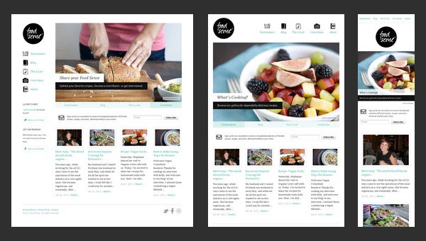
Note how various elements such as navigation, change position or even change, depending on the screen size.
On a desktop, for example, the main navigation sits in the left sidebar. But if you access the site on a tablet, it will shift to the top of the page. However, mobile users see only its text version, without accompanying icons.
But what’s important is that in spite of different layouts, the information still comes from a single source.
It’s the same code, the same URLs, same content. Meaning that you no longer have to manage separate entities for various devices, and can deliver a strong user experience to both, mobile and desktop visitors.
And here’s the most important part:
Google recommends responsive design as a way to serve mobile content to users.
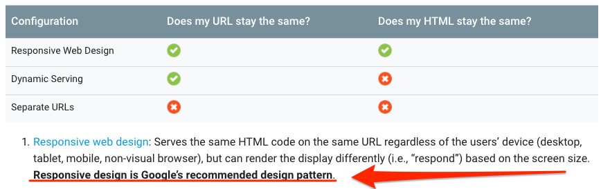
In 2015, Google’s John Mueller said on Google Plus (quoted via SEL):
“A good way to make it [a site] work in both worlds [mobile & desktop] would be to have a site that uses responsive web-design techniques to adjust to the size of the user’s device/settings.”
How Does a Responsive Website Aid SEO Efforts?
We’ve already discussed the first benefit. Using a responsive design means having a single site, and a single URL. And as a result, being in full control of the key asset that’s responsible for your rankings.
Responsive design also increases user experience if implemented correctly as noted by sites like UX Pin.
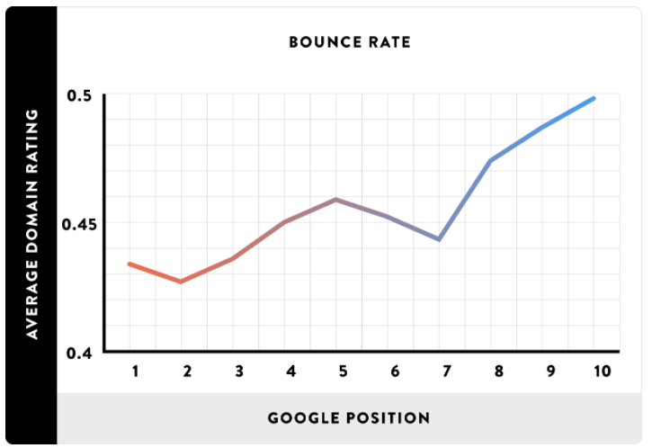
In fact, using responsive layouts is all about providing the best possible experience to users, regardless of the device they use. This, in turn, reduces the bounce rate, sending strong authority and quality signals to Google.
As Brian Dean discovered while analyzing Google search results, there is a correlation between bounce rate and rankings.
Finally, responsive websites eliminate the potential for duplicate content that could occur between mobile and desktop sites.
Moving to a Responsive Design Website
First of all, if your organization didn't have a mobile site, then you’re in luck. You don’t really need to take any additional steps when launching a responsive site. Unless you radically change the entire website, your URLs and the site’s structure will remain the same.
The only difference will be the code on your website.
But, if you currently use a mobile version of the site, then first and foremost, you will have to redirect mobile pages to their desktop counterparts. Since when you launch a responsive design and remove the mobile site, your mobile URLs (typically starting with M.) will cease to exist.
Unless you redirect them to relevant desktop URLs, Google might stop ranking those pages for mobile queries, resulting in a huge drop in traffic and search visibility.
Measuring the SEO Impact of the Responsive Design
Finally, here are a couple of suggestions for maintaining the data after the move.
A major challenge with analyzing the impact of such a massive change as dropping a mobile site, is having access to historic data.
After all, when you redirect m. URLs to relevant, responsive pages, you are going to lose all the information about their performance to date within a standard analytics setup.
TIP: if you’re using our platform, seoClarity, then implement a “parent-child” association to transfer historical SEO data to the new URL.
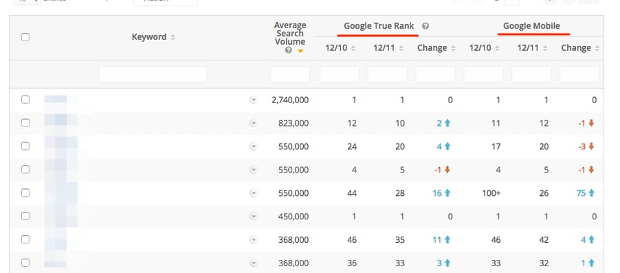
If you’re using Google Search Console to monitor your average rankings per query, etc., analyze your reports for mobile traffic alone. This will help you to quickly assess the impact of responsive design on your mobile visibility.

Worth to note: In seoClarity, you can track both desktop and mobile rankings, and compare their performance to notice any improvements or declines in mobile traffic.
Conclusion
2017 is the year the web officially went mobile.
And with the impending rollout of the mobile-first index, it’s crucial that organizations ensure they not only provide excellent mobile experience but also, use technology that’s capable of maintaining their rankings in SEO - responsive design.


Comments
Currently, there are no comments. Be the first to post one!