
As marketers, we emphasize mobile SEO in practically every aspect of our work today.
We optimize our strategies to target mobile users first. We analyze which mobile devices send the most traffic regularly. We place our entire effort into gaining visibility in the mobile search.
Yet, when it comes to content marketing, we still write and optimize copy with desktop devices in mind.
Don’t believe me? Consider how often you:
- Review new content for usability and readability on a small screen,
- Assess whether visuals will display well for mobile users, or
- Ensure that readers will be able to return to your content after clicking an external link.
Exactly.
It’s no secret that many of today’s customers search more on mobile devices than on their desktop machines. And, as Google reports, they’re more and more comfortable using mobile search for products other than hot-ticket items.
Even searches for “salt” on a mobile device have grown by 215% recently.
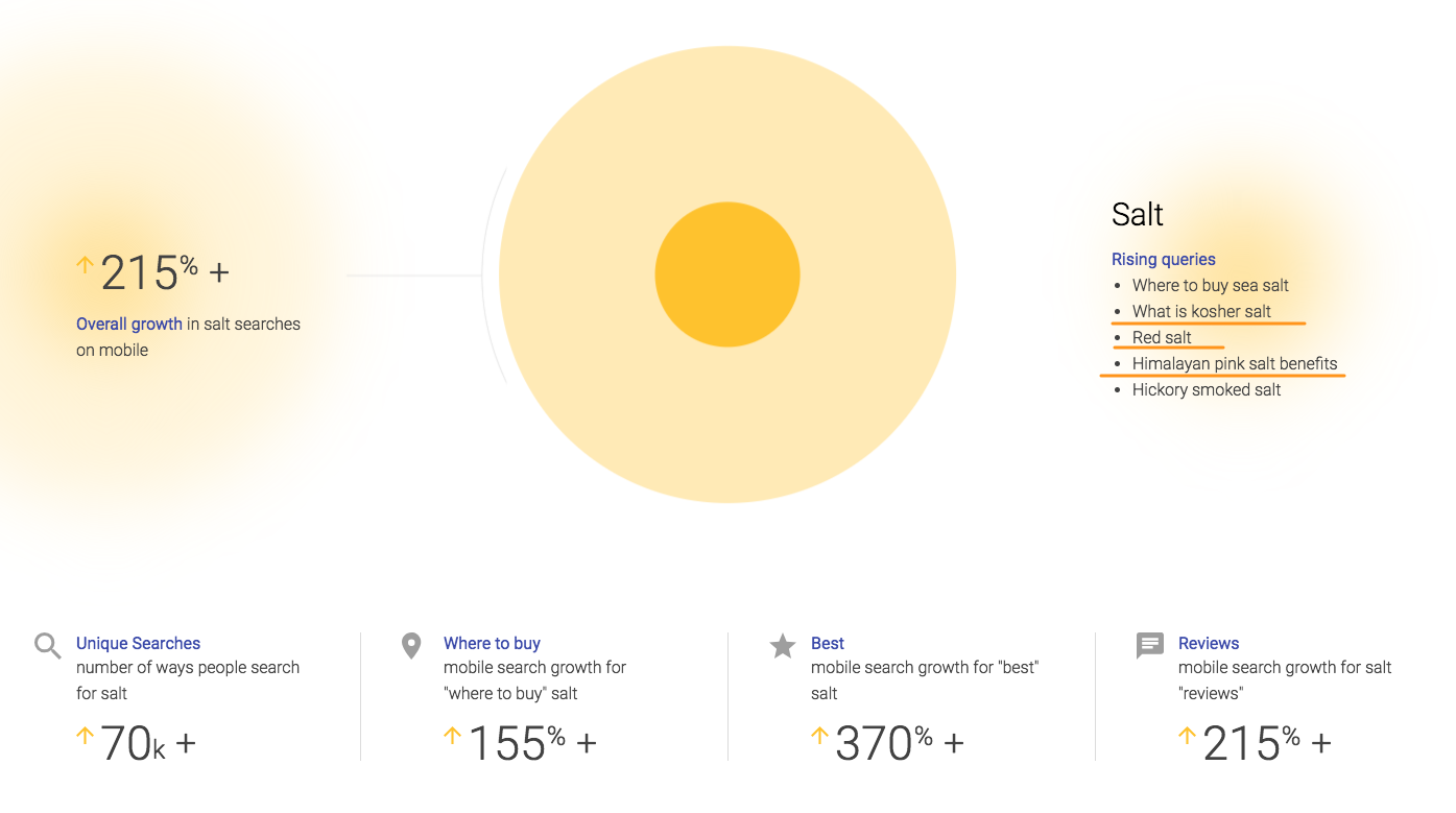
Many of those searches have informational intent. Such data suggest that anybody looking for them expects to find blog posts or other similar content, rather than a product page.
And needless to say, they’ll want to consume it on their mobile device, too.
As a result, your content should be optimized for mobile devices first.
To help you make it happen, in this post, I decided to share some ideas to ensure that you have a proper mobile content marketing strategy in place.
Part I. How to Write Mobile Content Better
Reading content on a mobile device often feels cramped.
Small screens make it difficult to get into the nuances of the page. Trying to navigate the content with a finger frequently results in errors or leaving the page by accident. Not to mention that, on many occasions, we try to consume content while multitasking, so the risk of interruption is high.
A mobile content strategy, therefore, should first and foremost take into consideration how users read content on their devices and create it optimized for their experience from the start.
Here’s how you should write every content piece to ensure the best reading experience:
Use shorter paragraphs and sentences. They make it easier for a person to scroll or skim the content and still understand your key message.
Clearly separate paragraphs with spaces. Again, it makes it easier to navigate through sections of content.
Include bulleted or numbered lists. Such formatting makes absorbing the content on a mobile device much easier for the reader.

Use sub-headings to explain every section of the piece. Instead of making sub-headings conversational, use them as signposts to guide a person through the content.
For example, this content uses sub-headings to keep the conversation with a reader going. But that assumes that a person actually reads every word on a page (which, given modern readers' attention spans, rarely happens these days).

Instead, use your sub-headings as indicators explaining the content of each section. This way, you’ll help a person quickly identify the information they’re seeking.

One more benefit of writing descriptive subheadings is that you could use them as basis for updates to share on social media.
After all, such subheadings often explain a benefit of reading the copy, they can make for an engaging social media content.
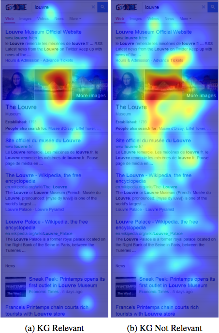
When explaining complex concepts, include graphics to illustrate your points. In spite of the ongoing debate whether the famous statistic about the speed at which we process images is true, the fact remains – we comprehend visuals faster than text. Content that features mobile-optimized images may work better for the audience and let them absorb the information before the next interruption.
Plus, eye-tracking studies have already confirmed that mobile users look at images more.
For example, here’s the difference in a focus on images vs. text in SERPs.
Include more semantic terms in the copy. Semantic terms help search engines understand the topic of the page better. But they can also help a person get more context about what they’re reading. Particularly, when they relate to how they typically describe the issue or topic.
When scanning the copy, these terms will stand out to mobile users, confirming the validity of the information they’re reading.
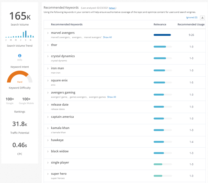
Content Fusion, our AI SEO content writing tool, allows you to analyze the topic before and after writing to identify critical semantic terms you should include. With a list of recommended keywords, you'll be ready to create the most authoritative content possible, all at scale.
Another benefit of doing the above is increasing relevance. Unfortunately, mobile devices still offer inferior browsing experience to desktops. For one, tapping links or swiping through search listings on a small screen can be problematic.
Most users, as a result, prefer to identify the most relevant search result fast, rather than going back and forth through search listings.
Expanding the content with semantic keywords increases the chances that Google will rank it well for the most relevant searches. This, in turn, can result in greater quality signals and even higher search positions.
Part II. Optimizing the Usability of the Mobile Content
Not long ago, Mobiforge, an independent mobile development community wrote in one of their articles:
“User experience counts even more on mobile devices and it is one of the main factors determining if a site has a solid conversion rate or a high bounce rate.”
They’re right. Users can determine within seconds if the content would be simple to consume on their device. And if not, they move on immediately.
But optimizing mobile content for usability goes beyond just making it look good on a smartphone screen.
Here are some factors you should consider when launching a mobile content strategy:
Remove any disrupting elements from your content. It’s true that popups, slide-ins and other calls to action can attract signups and help deliver results with content. But on a mobile device, they can also disturb a person’s reading experience.
(That’s one reason why Google has been so openly against those mobile marketing strategies, by the way.)
If you absolutely must use those calls to action, then make them cover no more than 25% of the screen. Also, include a click off button large enough so that a person could tap it without effort.

Increase space between elements to make them easier to tap. We’ve already talked about how troublesome navigating a website with tapping can be. To make it easier for your users to do so, move elements apart more. This way, you’ll reduce the risk of them clicking something else by accident.
Make links open in the same tab. I admit that this goes against what we’re used to doing on a desktop. However, on a mobile, any other open tabs apart from the one a person is currently viewing remain hidden. This means that a person might easily forget about your content, as they browse other content, following external links. As a result, they might never come back to your article. You can prevent this by having links open in the same tab, depending on your overall content objectives.
Ensure your content loads lightning fast. We’ve talked a lot about the importance of page load speed here on the blog already. And, for a good reason. Google constantly reminds us what a crucial factor page speed has become.
Audit your mobile page speed regularly to eliminate any issues that arise. seoClarity offers the insight into both page speeds and report where any issues occur specifically. With it, you can eliminate issues that can hinder usability for both, desktop and mobile users, improving search visibility overall.

Conclusion
We emphasize the importance of mobile all the time. Yet, when it comes to content, we still focus on desktop devices. Hopefully, in this post, you’ve discovered how to turn this around, and create mobile content that can deliver rankings and visibility in the mobile search.


Comments
Currently, there are no comments. Be the first to post one!