
Some viewport tags incorrectly have a specific width set instead of ‘width=device-width’.
This creates usability issues for users, and works to damage the user experience. Read on to learn how to address the problem.
Table of Contents
Why Avoid Specific Widths
A specific width set in the viewport tag will present content at the specified width, no matter the device type.
This means that content would load to match that width, no matter if users were on a desktop or mobile device. However, the browser will try to compensate for the issue by adjusting the font size or otherwise altering the presentation of the page.
The end result could mean a user has to pinch, zoom, or scroll to properly read the content.
How to Change the Viewport Tag’s Width
A better approach is to have the content adjust dynamically based on the width of the device.
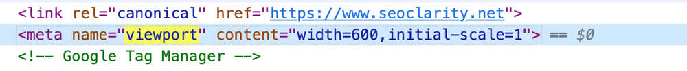
So, instead of having a specific width, like this …
<meta name="viewport" content="width=600, initial-scale=1">
… it benefits the user experience to have a ‘device-width’, like this …
<meta name="viewport" content="width=device-width, initial-scale=1">
This change requires an update to your site’s code, so you may need to bring in the dev team if you don’t have the proper edit access to make the changes on your own.
Changing Viewport Width at Scale
Another way to solve this issue — and solve it on your own, no dev team required — is with SEO execution platform ClarityAutomate. Your viewport tags can be updated at scale, across thousands of pages.
If your viewport tag needs the device-width, here’s a quick 5-step process to follow in ClarityAutomate.
- Select what you'd like to optimize: Code
The optimization starts by selecting “code”, since that’s what we’ll be updating.
- Choose how you'd like to optimize it: Update
We need to update the viewport tag, so we select that in this step. (ClarityAutomate also gives you the ability to add or delete site elements.)
- XPath: XPath that points to the <meta viewport> on the page
This step focuses on the viewport tag that needs to be updated.
- Attribute: content
The attribute in this case is content.
- New Value: The new value of the content attribute with ‘width=device-width’
Lastly, we add ‘width=device-width’ to the content attribute of the tag, and push the change live.
Before and After
Without the need to bring in the dev team, we were able to implement this change in a matter of minutes with ClarityAutomate.
Looking for other viewport issues?
- Missing Viewport Tag
- Multiple Viewport Tags Were Found in the <head>
- Viewport Tag Does Not Have a Width Set
- Viewport Tag is Missing the Initial-Scale Attribute
- Viewport Tag is Missing the Width Attribute
- Viewport Exists Outside the Head
- Viewport Has a Maximum-Scale Set
- Viewport Has a Minimum-Scale Set