
The browser's viewport is the area of the window in which web content can be seen. Since it deals with page presentation, it will naturally vary depending on screen size. The viewport on a mobile device, for example, will be smaller than that of a computer screen.
Table of Contents
What is the Viewport Tag?
A viewport tag ( a <meta> element) tells the browser how to control a page’s dimensions and scaling for its presentation.
If the viewport element is missing, mobile browsers will default to rendering the page at the screen width of a computer screen — this tends to be 980px, but can vary.
If this is the case, mobile browsers will increase font size and try to either scale the content to fit the screen or show only the content that fits on the screen in an effort to make the presentation look better for users.
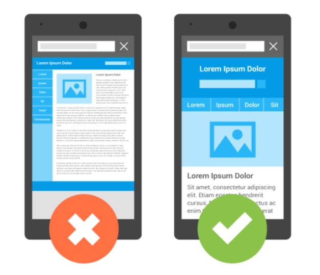
(Image Source: Google Developers)
In the example above, you can see the same web page presented with and without a meta viewport.
The left image shows no viewport implementation, which causes the browser to render the page with desktop width, making the entire page fit on the screen in one view.
On the right side, with the viewport specified to match the device type, the browser doesn’t scale the page, which makes the content easy to read.
Setting the Viewport
Pages that are optimized for multiple devices (i.e. responsive web design) must have the viewport tag in the head section.
Here is an example of the viewport tag:
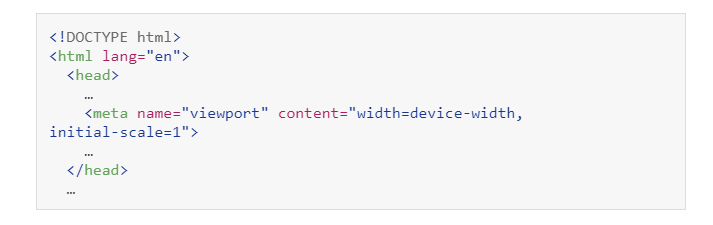
The viewport value “width=device-width” tells the page to match the screen’s width in pixels appropriate for the respective device. This is known as device-independent pixels.
A device-independent pixel (or density) is a representation of a single pixel, which can consist of multiple physical pixels on a high-density screen. This is what allows the page to match the appropriate screen size.
Also in the head section you see “initial-scale=1”. This tells the browser to establish a 1:1 relationship between CSS pixels and device-independent pixels regardless of the orientation of the device. This, in turn, allows the page to use the full landscape width for its presentation.
Some browsers keep the page width constant, even if a device is rotated to enable landscape mode. This zooms in to the content instead of allowing it to reflow to fill the new screen layout completely.
Other attributed that can be set in the viewport tag include:
- Minimum-scale
- Maximum-scale
- User-scalable
Google, however, does not recommend these attributes, as they can disable users’ ability to zoom the viewport which can lead to accessibility issues.
Size Content to the Viewport
For both desktop and mobile devices, users scroll vertically — not horizontally.
Users receive a poor experience if they are forced to scroll horizontally or zoom out in order to see content.
This can occur accidentally when developing a mobile site with the meta viewport tag and the page content doesn’t fit in the specified viewport.
Other Guidelines to Follow
1. Do not use large, fixed width elements
If an image is displayed at a wider width than the viewport, the viewport may scroll horizontally. Make sure to adjust this content to fit within the viewport.
You can add the following to your stylesheet so you don’t have issues with images creating a scrollbar: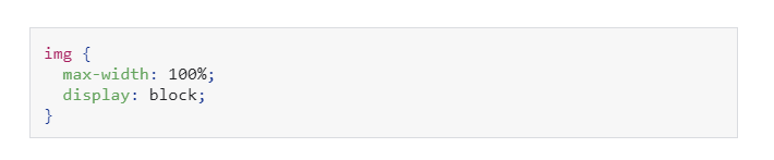
2. Do not let the content rely on a particular viewport width to properly render
Screen dimensions and width in CSS pixels vary widely depending on device type. Modern CSS techniques like Flexbox, Grid Layout, and Multicol make the creation of these flexible grids easy.
3. Use CSS media queries to apply different styling for small and large screens
Page elements can become too large for the viewport on small devices if you set large absolute CSS widths for the page elements.
Use relative width values instead. (Example: width: 100%.) Also be mindful of using large absolute positioning values. The element may fall outside of the viewport on smaller devices.
Common Viewport Tag Issues
1. The viewport <meta> tag does not have a width set
If we don’t set the width, mobile devices render the page at a desktop screen width and then try to
make the content look better by increasing the font size and scaling the content to fit the screen.
More on this issue: Viewport Tag Does Not Have a Width Set
2. The viewport <meta> tag has a specific width set
If we set the specific width, mobile devices will render the page at the width even on devices that are larger or smaller, and then try to make the content look better by increasing font sizes and scaling the content to fit the screen.
More on this issue: Viewport Has a Specific Width Set
3. The viewport <meta> tag is missing an initial-scale
Without the initial-scale attribute, mobile browsers will render the page at a desktop screen width, and then try to make the content look better by increasing font sizes and scaling the content to fit the screen.
More on this issue: Viewport Tag is Missing the Initial-Scale Attribute
4. The viewport <meta> tag initial-scale is incorrect
By default the initial-scale=1. setting the initial-scale to a value other than 1 will make the page content appear zoomed in (or out) on mobile devices.
5. The viewport <meta> tag prevents the user from scaling
The user-scalable attribute defines whether users can scale (zoom) the page content on mobile. By default, scaling is on, but if user-scalable is set to '0' or 'no' then this will prevent users from zooming, which negatively affects user experience. It's an optional attribute for the viewport.
<meta name="viewport" content="width=device-width, user-scalable=no">
6. The viewport <meta> tag has a maximum-scale set
Setting a value for the 'maximum-scale' attribute could prevent the user from scaling properly, meaning that users may not be able to zoom in/out on mobile devices, and may cause accessibility issues. It's an optional attribute for the viewport.
More on this issue: Viewport Tag Has a Maximum-Scale Set
7. The viewport <meta> tag has a minimum-scale set
Setting a value for the 'minimum-scale' attribute could prevent the user from scaling properly, meaning that users may not be able to zoom in/out on mobile devices, and may cause accessibility issues. It's an optional attribute for the viewport.
More on this issue: Viewport Tag Has a Minimum-Scale Set
8. Viewport <meta> tag is missing
Configuring the viewport tag will increase the device-friendliness of your site. The viewport tag is a <meta> element that lives within the <head> section of your site.
More on this issue: Missing Viewport Tag
Once you’ve established the attribute, it’s time to add it to your pages. Remember that the tag goes within the <head> section of the page.
More on this issue: Viewport Tag Exists Outside the Head Element
More on this issue: Multiple Viewport Tags Were Found in the Head Element